

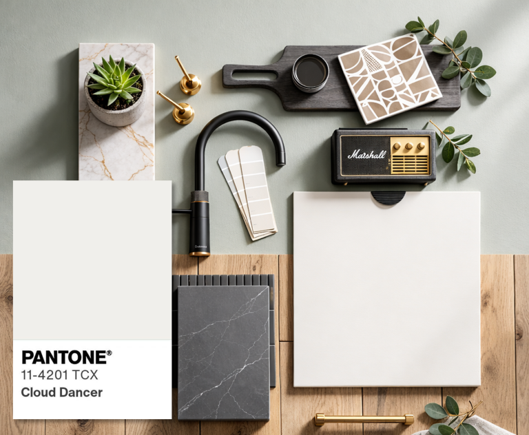
Pantone’s Colour of the Year for 2026 is PANTONE 11-4201 Cloud Dancer – a soft, whispery off white designed to feel calm, clean, and adaptable. Pantone describes it as a versatile ‘structural’ colour that supports the rest of the spectrum, letting other colours shine.
In kitchen terms, Cloud Dancer is the kind of white that looks fresh but not stark. It has a gentle warmth, so it tends to feel more welcoming than a bright, clinical brilliant white.
What Cloud Dancer looks like
Think soft white with a tiny hint of warmth, like clean linen in daylight. It’s not cream, and it’s not icy grey, it sits neatly in the middle, which is exactly why it works so well in kitchens.
Pantone’s official reference is 11-4201 TCX Cloud Dancer.
Where Cloud Dancer works best in a kitchen makeover
- Cupboard doors and drawer fronts
If you want the biggest transformation without changing your layout, Cloud Dancer is ideal for:
- Shaker doors: classic, warm, and suits most UK homes
- Simple slab doors: clean, modern, and makes small kitchens feel larger
Why it works: because it brightens the room and makes the kitchen feel calmer but still leaves plenty of space for personality through worktops, handles, and splashbacks.
Practical tip: choose a finish that fits real life:
- Matt or super matt: soft, premium look, hides fingerprints better than high gloss
- Satin: still smooth and wipeable, with a slight glow in daylight
- Walls (especially if your units are staying darker)
If you would like to upgrade cabinetry to a dark colour, Cloud Dancer is brilliant on the walls because it:
- Lifts the room
- Keeps it feeling airy
- Softens strong contrasts
Best places to use it:
- The main kitchen walls
- Open plan spaces where you want the kitchen to blend into living areas
- Ceilings if you want maximum light bounce (great in north facing kitchens)
- Splashbacks (for a clean, modern backdrop)
If you like a simple, timeless look, you can use Cloud Dancer as the ‘quiet’ element behind feature worktops or bold hardware.
Good options:
- White metro tile (paired with a warm grout)
- Large format pale tile to reduce grout lines and keep it looking calm
- Glass splashback in an off-white tone if you want a seamless feel
Cloud Dancer is clean and versatile and works well as a backdrop in interiors.
Colour pairings that look great with Cloud Dancer in kitchens
Cloud Dancer is a backdrop colour, so pairing it well is what makes it feel “designed”.
Warm and welcoming
- Light oak, mid oak, or walnut tones
- Brushed brass handles
- Warm whites and soft beige accents
This gives you that calm, cosy, lived in feel without looking dated.
Crisp and modern
- Grey veined quartz
- Chrome or brushed steel handles
- Simple white splashback
This keeps everything bright and streamlined, especially good for smaller kitchens.
Colour pop without going bold
- Sage or olive accents
- Inky navy island or tall units
- Muted terracotta accessories
Cloud Dancer helps those colours feel sophisticated rather than shouty.
Two easy Cloud Dancer kitchen schemes you can picture straight away
Scheme A: The classic modern makeover
- Doors/drawers: Cloud Dancer
- Worktops: light quartz or quartz overlay with subtle veining
- Handles: brushed nickel or soft brass
- Splashback: simple off-white tile
- Tap: brushed steel or warm metallic finish
Result: bright, calm, and timeless.
Scheme B: The warm contemporary kitchen
- Doors/drawers: Cloud Dancer
- Worktops: warmer toned stone effect
- Handles: brass or black
- Splashback: warm white or creamy tile
- Tap: brass or brushed steel
Result: softer, homier, still modern.
The common mistakes
- Pairing Cloud Dancer with a very icy grey can make it look slightly creamy by comparison.
Fix: stick to warm greys, greige, or soft neutrals. - Using bright brilliant white alongside it (for example stark white tiles) can make Cloud Dancer look darker than intended.
Fix: choose tiles and paint that sit in the same ‘soft white’ family. - Not testing in your lighting. Whites change dramatically between north and south facing kitchens.
Always sample colours in morning and evening light before committing.
If your kitchen looks tired but the layout still works, you don’t necessarily need a full refit to get a dramatic change. A well-planned makeover focuses on the parts you see and touch every day, while keeping what’s still doing its job.
Want help choosing the best route for your kitchen?
Get in touch today and we’ll talk through door styles, worktop options and any finishing details.
Choose Kitchen Makeover Group. The smarter alternative to a new kitchen.